In my previous post, "Autumnal Treasures" I experimented with hand painted text and digital watercolor textures for my
upcoming fall card. Here's what I'm working on today:
This is a typical concept sketch for me. It's a quick record of an idea without much specificity. I haven't yet defined the texture of the bounding element. Also, the composition of the persimmons is very rough. It's helpful to get basic ideas down loosely so the project can improve as it develops.
This is my style/color test for the persimmons featured in the center of the card. The medium is digital watercolor using Kyle Watercolor Brushes in Adobe Photoshop.
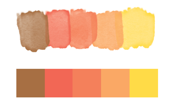
Swatches! Since I use both transparency and opacity in my work it's important to see how the colors look both ways. Identifying a palette and sticking with it is a great way to bring harmony to the work. If I make a mistake at this stage, like failing to include a green (oops), I'll return to this step and make sure the new color works well with the all the others instead of adding it to the image on the fly.


