Gopher Snake and Western Rattlesnake

Concept

The intention behind this piece is to introduce two California natives, the gopher snake and Western rattlesnake and to highlight some physical differences. As the image was destined for Instagram, I’ve chosen a square format and an attention-grabbing composition.

As the image is a commission/collaboration with Things That Creep, I presented this initial sketch for review. The concept was accepted, but as I read more about the two species, I was intrigued by the harmless gopher snake’s ruse of coiling and vib…

As the image is a commission/collaboration with Things That Creep, I presented this initial sketch for review. The concept was accepted, but as I read more about the two species, I was intrigued by the harmless gopher snake’s ruse of coiling and vibrating its tail in dry grass to imitate the venomous rattlesnake. This technique of imitating a dangerous species is called Batesian mimicry Even though I felt the original composition was stronger and I didn’t have room in the image to discuss mimicry, this design opened the door for further discussion.

rattler vs gopher_2.jpg
Pupil shape differs in the two species, and is a great way to differentiate between venomous and non-venomous species. Labelling this would have crowded the image, but getting it right and making the pupils highly visible paves the way for further d…

Pupil shape differs in the two species, and is a great way to differentiate between venomous and non-venomous species. Labelling this would have crowded the image, but getting it right and making the pupils highly visible paves the way for further discussion.

Final image

As all imagery was created digitally, the elements are modular, and can be easily reformatted in future to include more/different information or fit a different page size.

rattler vs gopher 6.jpg

Awards Show!

I'm delighted to announce that a modified version of my 2018 summer greeting card has been accepted into the Academy of Art Spring Show 2018!

It will be on display until June 9 at 2225 Jerrold Ave. San Francisco.

AWARD SHOW INFO

anooshmoutafian_childrensbook5.jpg

Honored to see my work in the company of so many gorgeous illustrations.

Hope to see you there.

As always, hit me up to join my greeting card list. hello@anooshbooks.com

Safe Space for Amphibians

AnooshBooks is partnering with Lick Your Eyeballs Reptiles to produce a booklet on reptiles and amphibians to share with our clients and local schools! The first page "Safe Space for Amphibians" is now complete!

amphibian_safe_space5.jpg

Purpose: To provide ways to support our local embattled species of amphibians including frogs, salamanders and newts. 

Considerations: In creating this piece, we intentionally introduced ideas which could be implemented in a range of outdoor spaces, including small yards and even balconies. 

Additional Uses: In addition to inclusion in our upcoming booklet, this piece will be available as a free handout at our upcoming event for "Save the Frogs Day". This free, public event will be held at the Shorebird Nature Center on April 28th, 2018. 

Support and Guidance: Lick Your Eyeballs and anooshbooks will be partnering with the City of Berkeley to throw the event. Save the Frogs Organization provided editorial guidance and recommendations in the choice and presentation of ideas.

Juju Magic Packaging Illustration and Design

Product: All-natural salve, handmade in Hawaii by Juju Magic. 

Background: The design and illustration needed to reflect the joyful spirit of the brand. The owner Julie contacted me because she liked my Spring 2017 greeting card and wanted a similar style for her packaging. I was provided with an ingredient list and product samples (which were fantastic).


1_spring card.jpg

                                                                   Style guide

Julie liked the bright colors and joyful feel of this piece. With this style guide in mind, I moved forward on the project. 

Concept sketch

Here are my original sketch and notes. For this project I had nearly complete creative freedom in terms of subject matter. A rainbow seemed an appropriate nod to Hawaii and I featured lavender sprigs as they are one of the main ingredients in the salve. 

julie logo concept.jpg
 

Draft

Julie was happy with this, but missed the rainbow of earlier versions and wanted to include an ingredient list.

Julie was happy with this, but missed the rainbow of earlier versions and wanted to include an ingredient list.

Final Work:

Even without the rainbow, there just wasn't room for an ingredient list on the <2 inch diameter tins. So, we negotiated a second image for the back of the tin. Julie's rainbow had a home and  provided a nice visual surprise upon flipping over the tin. I added a faint suggestion of the rainbow on the front to tie the images together.

small_JuJuMagicLogo10.png
small_JuJuMagicLogoBack5.png

At present, Juju Magic Salve is available only in Hilo, HI, but I'll post updates as distribution widens. Looking forward to seeing the design on my new favorite salve. 

Basic Instruction for Hand Drawn Science Illustration

Science Illustration: What and Why

Science illustration, the accurate rendering of a subject with the intention to understand and communicate, arguably dates back to cave paintings. Our methods and technology have evolved, but our goals remain unchanged. Drawing holds us as observers to a higher standard than snapping a photo or using a scanning device. You must understand what you are seeing in order to record it. 

Goals and Course Expectations for Bio 127 UCSC Ichthyology

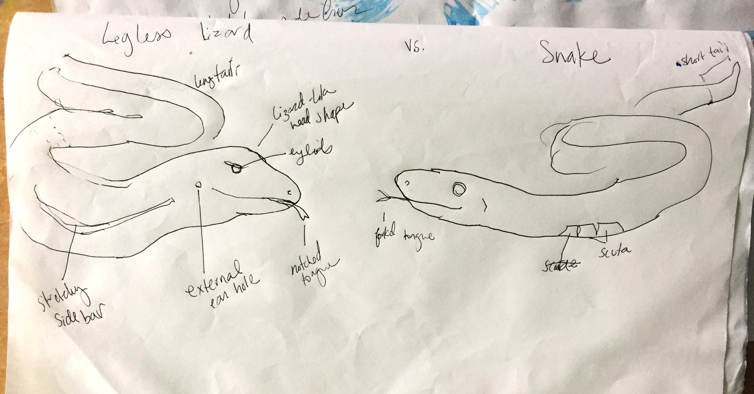
During this lab, you will be expected to complete illustrations using the given samples as your subject. These works should "illustrate" or communicate identifying features. In addition, you may be asked to label anatomical landmarks or create detailed drawings of specific parts.

Your illustrations should be planned (fit the page) and accurate (drawn faithfully from reference).


Method

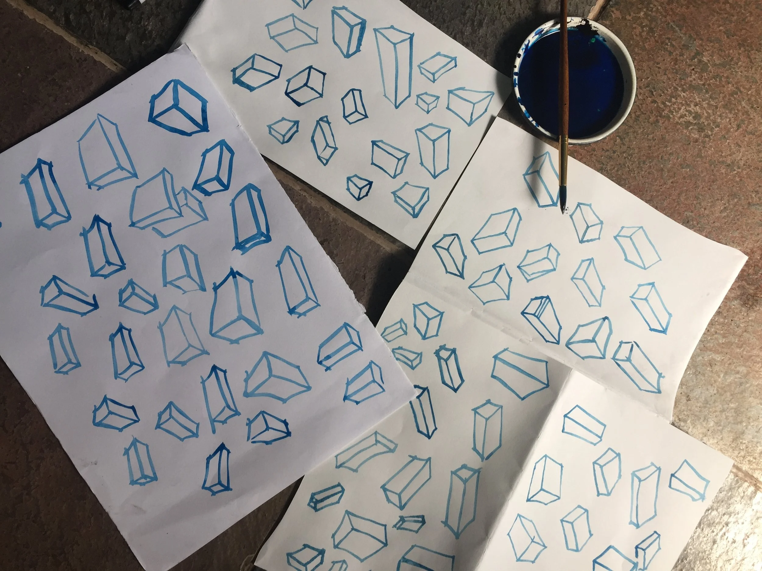
1.  Look carefully. Take time to observe your subject before beginning to draw.

2. Choose what to include. Think about the structures and features you want to communicate. Will you include the entire specimen or just one section? Are you viewing the specimen from the top, bottom or side? Reread lab notes to make sure all required features are included.  

3. Plan your drawing. Measure your subject using a ruler or other tool. Plan image on page.  Double check relative measurements (length of head compared to total body length etc). Make light or erasable marks on page noting landmarks and location of features to be included. 

4. Record information. Carefully and deliberately record your observations. Approach with curiosity and allow yourself to ask questions. If something puzzles or interests you (bright markings, highly modified fins etc) note these observations legibly and continue with your task.


Drawing Tips

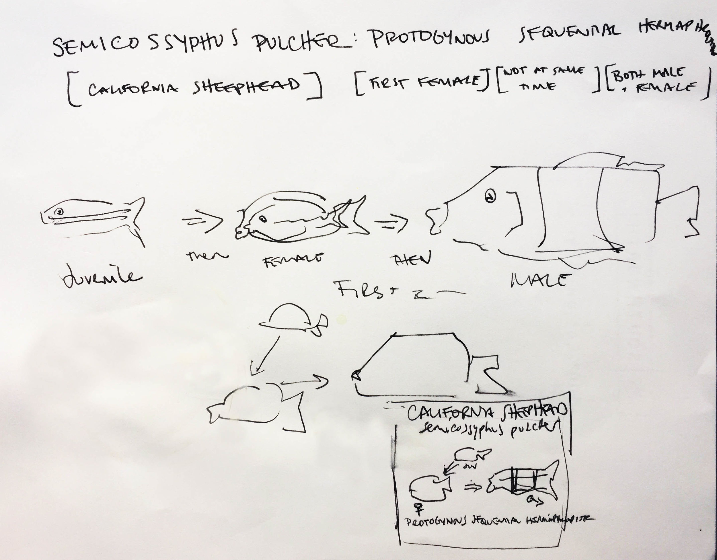
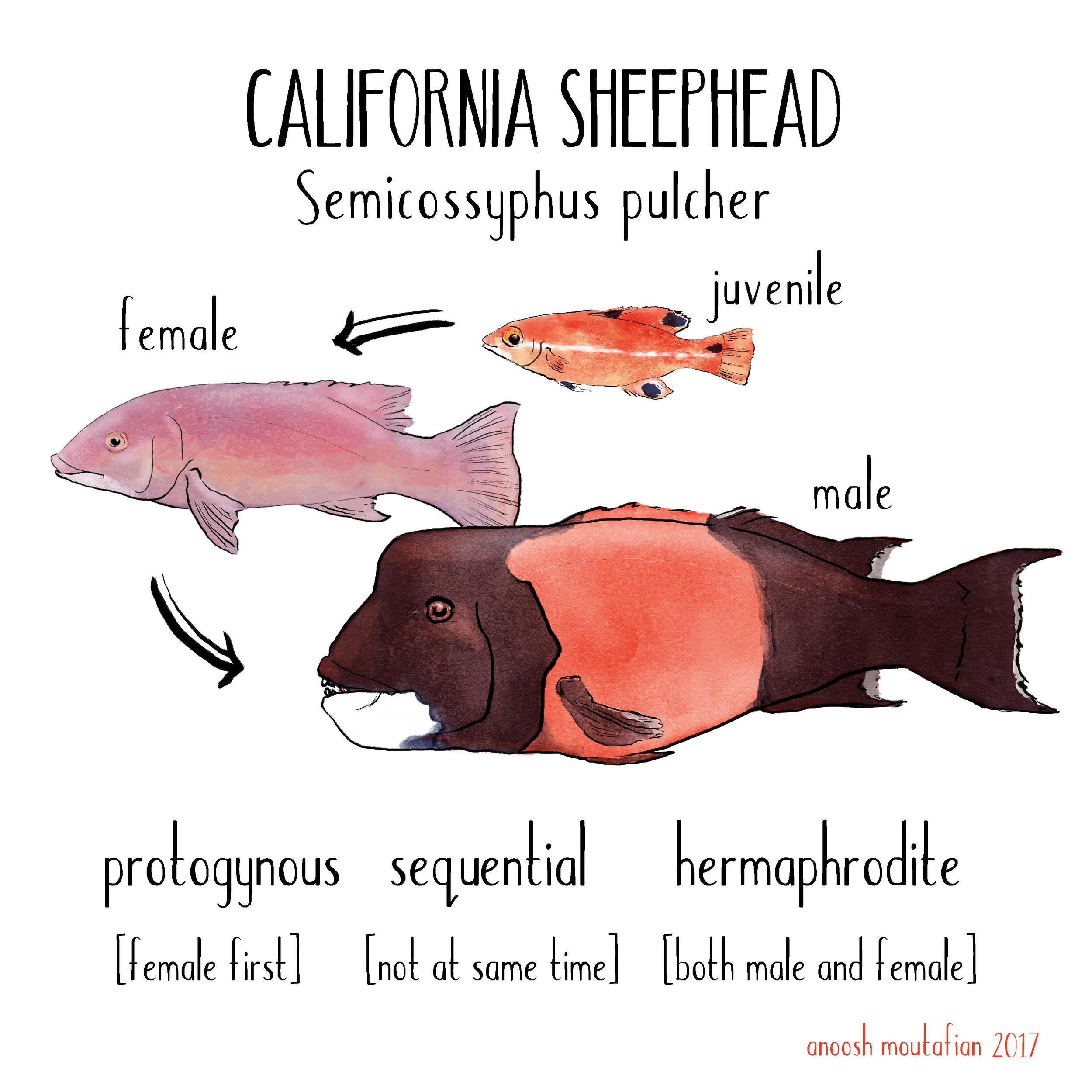
Draw "big to small". Focus on getting an accurate outline and correct placement of landmarks before tackling details.

Recheck your proportions and relative distances between landmarks frequently.

Use light strokes in the beginning. Once you are confident in your image apply darker line focusing on economy of stroke to ensure clarity. Try to avoid scratchy or sketchy lines in final drawing. 

Attempt to resist "symbolic drawing" such as cartoon eyes or generic representations. Strive to record the subject exactly as you observe it. 

Let go of anxiety about creating a "pretty picture". Our goal is to represent our subject accurately and clearly communicate our observations and the required information. 

And remember, drawing is simply another skill. Everyone will improve in speed and accuracy with dedicated practice. 

Additional Resources

The Laws Guide to Nature Drawing and Journaling, written and illustrated by John Muir Laws

Drawing on the Right Side of the Brain, by Betty Edwards (This one has some outdated ideas about lateralization of the brain, but is a great intro to observational drawing)

Videos by Alphonso Dunn (available on YouTube). Drawing basics delivered by a drawing pro with a science background. 

Science Illustration program at CSUMB

Additional blog posts at anooshbooks.com (Though not all science related, I break down my process for creating polished illustrations using digital media)

Shortcuts in Science Illustration

Science illustrations are intended to communicate specific observations of the subject. Accuracy and clarity are essential.

Modern tools are fair game as long as they achieve these aims.


Photography can be helpful. I began this project as a simple sketch. While trying to understand the leaf arrangement, I became interested in the growth pattern. A photograph allowed me to accurately and quickly record the image. I was then able to identify the pattern and overlay the numbers and text. 

anacampseros rufescens.jpg

The Jungle in your Living Room


Inspiration and Concept:


This piece was inspired my my own treasured houseplants. In reading a book on the history of English gardening, I came across a passage describing the importation plants which gave rise to popular cultivars. The purpose of this piece was to remind the viewer that the plant in their living room has exotic origins. I chose the dimensions
24" x 36" (plus bleed) as this is a common poster size. 


original concept sketch

original concept sketch

I created a line drawing of each plant including the covered portion 

I created a line drawing of each plant including the covered portion


Here I've added a partially opaque layer to the leaves.&nbsp;

Here I've added a partially opaque layer to the leaves. 

Color layers have been added, so the translucency is further diminished.

Color layers have been added, so the translucency is further diminished.

Taking the time to draw overlapped sections has multiple benefits: I'm aware of occupied space and am less likely to create impossible situations. It is more realistic because most leaves are translucent. Also, my work becomes modular; I can easily change the composition or recycle elements.

 
schefflera.jpg
peace lily2.jpg
dragon tree.jpg

These were pulled from the composition and became stand alone pieces.

I added text and a background to the final image. 

houseplant poster signed.jpg

Moving forward, I'd like to do more work with familiar plants such as these and perhaps create a series of cards to outline proper care.

Legless Lizard

Subject matter: 

As an educator with Lick Your Eyeballs Reptiles, introducing people to legless lizards is one of my favorite things. It challenges peoples conceptions and introduces the concept of convergent evolution (similar traits reached independently by organisms in similar environments). I found myself pointing out the same traits over and over again in presentations, so I decided to create a visual to complement my explanation. To learn more about these fantastic animals, check out this video put out by Lick Your Eyeballs.


concept copy.jpg

Concept Sketch

This is typically the only part of my process I execute by hand. I don't worry about it looking good at this phase. I just organize my ideas and draw out the elements I want to include.

composition.jpg

Composition

Next, I designed poses and composed the image. This is more challenging than simply finding a reference photo and copying the pose, but I find the compositional freedom makes it worth the extra work. It also forces a deeper understanding of the animal's anatomy and range of movement.

Reference

Luckily, I had access not only to images, but the actual animals. The lizard is based on Silver, a European legless lizard and the snake is based on Slinky, a California gopher snake, both part of the Lick Your Eyeballs menagerie. 

Finished Illustration


legless lizard_v_snake.jpg

Square Redesign

I recomposed the image as a square to post on Instagram (follow me at @anooshbooks). The resulting composition was actually stronger. One piece of negative feedback I got on the original was that it was unclear which was the lizard. The square format solved the issue.

legless_square.jpg

Final Notes

As with any project, this was a learning experience. Moving forward, I plan to work on my understanding of scales. 

California Sheephead

Subject matter:

Semicossyphus pulcher is a species close to my heart. I spent two years diving with California Sheephead while teaching at Catalina Island Marine Institute. The concept of sequential hermaphroditism (gender change) always blew students' minds so it seemed a great topic for an illustration. Also, these fish are gorgeous. 

Process: 

sheephead concept.jpg

First, a concept sketch.

I started with the text/illustrations I knew I wanted to include, then improved the design and settled on the bottom image. I chose a square format so it would look good on Instagram (shameless, right?)

digital ink with tall abbey font

digital ink with tall abbey font

digital watercolor using Kylebrush

digital watercolor using Kylebrush

Finished artwork

Finished artwork

Fall Card 2017 elements

Whoohoo! My 2017 fall card is ready to print. A successful illustration should be seamless, appearing as a cohesive image rather than an assemblage. However, looking at the elements individually can be an interesting exercise. Also, this approach helps me to stay on track and avoid becoming overwhelmed.

fall card 2017.png

This design can be broken down into
four main elements:


Text

Digitally edited original hand painted lettering.

fall card text.jpg
fall card illustration.jpg
 

Illustration

Original illustration digitally rendered


Border

Original border, digitally drawn and duplicated

fall card border.jpg
fall card background.jpg
 

Background

Gradient echoing colors found in the illustration using Kyle digital watercolor brushes

Illustrator's Day 2017

Illustrator's Day is an SCBWI event being held in San Francisco this September 17th. Caldecott winner Dan Santat and the wonderful Julie Downing will be in attendance. Illustration prompts are made available to attendees so we can bring in work to show and receive critiques.

Here are the instructions as posted on the event homepage:

For this year's optional assignment, David Caplan has presented two quotes to choose from to illustrate over 3, double-page spreads; 2 sketches and 1 finish. 

The quotes are:
“You’re braver than you believe, stronger than you seem, and smarter than you think.” – Christopher Robin
“Learn from yesterday, live for today, hope for tomorrow.” – Albert Einstein

And here are my submissions:

AMoutafian-1.jpg
AMoutafian-2.jpg
AMoutafian-3.jpg

Sticker Design

New sticker design for Lick Your Eyeballs Reptiles!

Artboard 1.png

LYE owner/founder Audra Barrios did the concept sketch for this one and I did the vector art. Great collaboration, now looking forward to seeing it in print!

Fall Card 2017 progress

In my previous post, "Autumnal Treasures" I experimented with hand painted text and digital watercolor textures for my
upcoming fall card. Here's what I'm working on today:

fall card 2107 concept sketch.JPG
 

This is a typical concept sketch for me. It's a quick record of an idea without much specificity. I haven't yet defined the texture of the bounding element. Also, the composition of the persimmons is very rough. It's helpful to get basic ideas down loosely so the project can improve as it develops. 


This is my style/color test for the persimmons featured in the center of the card. The medium is digital watercolor using Kyle Watercolor Brushes in Adobe Photoshop. 

persimmon color study .png
fall card 2017 swatches.png
 

Swatches! Since I use both transparency and opacity in my work it's important to see how the colors look both ways. Identifying a palette and sticking with it is a great way to bring harmony to the work. If I make a mistake at this stage, like failing to include a green (oops), I'll return to this step and make sure the new color works well with the all the others instead of adding it to the image on the fly. 

Autumnal Treasures


Experimenting in Photoshop today and getting started on my fall greeting card. The watercolor texture I used today comes from my one of my favorite digital watercolor brushes from kylebrush.com. The font is Tall Abbey by Tom Chalky. 

autumn hand lettering.JPG
 

I also played with some hand painted lettering. I used cheap paint and a liner brush on 24 lb ivory paper. I prefer smooth paper over heavy (and expensive) watercolor paper for this task. 

Still working out the message. The contenders are:

"Fall into Autumnal Bliss"         "Autumnal Treasures"       "Autumnal Delights"       or some combination.

I like to reference the season as well as include one impact word like Delight, Bliss, Treasure, etc. If you have a favorite, feel free to weigh in in the comments section. And as always, if you'd like to be on the list to receive my seasonal cards, 
send your address or email address to hello@anooshbooks.com. 


Congratulations Card (vector)

Here is the updated vector edition of the hand-painted card featured in an earlier blog.


I used Adobe Illustrator and played with the re-color feature I learned creating the "boat" image. The format (4x6) is slightly different than the seasonal cards I put out because this card was designed to be sold on redbubble.com. It's up for sale right now selling for a couple bucks/card. I'll put up a more formal announcement once I test drive the service for myself and iron out some bugs. 

It's a boat!

Doesn't look like a boat to you?

It's okay, it doesn't look like one to me either. 

Here's my interpretation of the iconic "boat" symbol from mathematician John Conway's "Game of Life." And by "game," we mean "cellular automaton." 

The image is to be used on the website of software developer Cory Dominguez aka "c11z." 

Among the advantages of working in Adobe Illustrator, it's easy to knock out samples varying color or other elements. Here are a few others I came up with using Illustrator's "recolor" tool.


Congratulation card

This weekend we're celebrating my cousin's college graduation! The event inspired me to create a congratulatory card. 

I had this doodle design which had the right celebratory sensibility. It also had a frivolous feeling which I didn't want, but straightening up the linework and font gave it some gravitas. 

congratulation_line.JPG

Monochromatic linework felt a little perfunctory, so I experimented with a bit of color

The final version utilized strong color and value contrast and retains the celebratory, yet dignified look I was going for. These photos are completely unedited, and you can see that my traditional paint work is not the neatest. I am satisfied with the design, so I'm planning a digital (and definitely cleaner) version. 

Congratulations Kevin!

back to boxes

It's natural to feel rusty after a drawing dry spell. But don't let it get you down.

Drawing boxes is a nice way to ease back into things.


There's no pressure to choose a clever subject, and no worries about failure, even wonky boxes have a certain charm. 


box1.jpg
 

If boxes seem intimidating, start with rectangles. 

Try playing with different media or adding color. Use scratch paper, leftover paint, or whatever is on hand. 

box4.JPG

So have fun drawing boxes and no worries over wonkiness. Unless you are an architect, the stakes are pretty darn low.